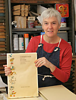
Felicia Rice is a book artist, typographer, printer and publisher whose work has earned her many honors. She lectures and exhibits internationally, and her books can be found in collections from the Whitney Museum of American Art to the Bodleian Library.
 COSMOGONIE INTIME An Intimate Cosmogony
Drawings and Bookwork
In 1973, at nineteen, I determined to join the San Francisco Bay Area book world as a letterpress printer. In 1977, I founded Moving Parts Press in Santa Cruz, California, expanding my dream to include fine art and literary publishing. By that time I had already worked with Jack Stauffacher and William Everson at UC Santa Cruz. I worked for Sherwood Grover, longtime Grabhorn pressman, and later inherited his press. I was also privileged to know and assist Adrian Wilson of The Press at Tuscany Alley in San Francisco. In recent years I have found it most rewarding to focus on one major book project at a time. Over the last seven years, slowly and painstakingly, I have created the collaborative book, COSMOGONIE INTIME An Intimate Cosmogony.
I consider it a privilege to offer this collection of poems by Yves Peyré to an American audience. Yves is, and has been, very engaged in artists’ books through his role as Director of the Bibliothèque littéraire Jacques Doucet, the French government’s library of first editions, manuscripts and publications of modern French literature. He is a member of the circle of writers and artists whose work makes up the Doucet collection, and has also written extensively on the twentieth-century livre d’artiste.
I felt it was important for COSMOGONIE INTIME to build on the traditions of the livre d’artiste. I employed hand-colored images using a traditional French stenciling process known as pochoir, and designed a very simple portfolio-style binding. I was excited to add to the Moving Parts Press Livres d’Artiste Series that began in 1993 with Meidosems, my first project with translator Elizabeth R. Jackson, old family friend and professor of French Literature.
On a very personal note, the artist for this project was my father, Ray Rice, who died in 2001 at the age of eighty-five. His rich career as an artist was driven by a strong Midwestern work ethic and unswerving internal compass. He spent more than sixty years on the American art scene and his list of awards, exhibitions and commissions extends back to the early 1950s. This book is our fourth collaboration.
One of my earliest memories is swimming with my father off our dock in the Corte Madera Creek, a tributary to the San Francisco Bay. In the summer and fall he would swim every day, long deliberate strokes up the creek and then back, while I dog-paddled close to the dock. Water—getting in it or floating on it, observing it—was an important part of my dad’s life. Living near it was imperative. The last thirty years of his life he lived in a small red house cobbled together from Chinese laborers’ shacks in the former logging town of Mendocino, California, overlooking the Pacific. Slivers of the ocean, its incessant movement, the changing color and shifting light appear in most of his paintings. Rosemary Lloyd writes, “Peyré’s poetry transforms simple seaside memories into symbols of beauty and power….” Although the two never met, what Yves recognized in Ray’s work, Ray also responded to in Yves’s work—an intense love of the natural world.
When Yves arrived on the West Coast for a visit in 1997, Ray had been painting abstract, figurative totemic images of people, places and things in oils on long narrow wooden strips for several years. These paintings hung in my home, in the home of collaborator Liz Jackson and in Ray’s home. My father was in the hospital when Yves was visiting from Paris. The day after Yves declared that my father should be the artist for this book, I marched into my father’s hospital room and announced that it was time to get well, we had work to do. Always one to rise to a challenge, my father got up out of bed and undertook the project that compelled him through the last years of his life.
Early in our discussions of the book design, Ray and I agreed to incorporate vertical drawings to the left and right of the gutter of each page spread. The five long, narrow poems evoked long, narrow strings of drawings that mirrored one another and reflected the French and English translation on opposing pages. The drawings would be a maximum of three inches wide to allow plenty of white space around the poems, establishing a limitation which helped set the imagery free. Ray began by reading the manuscript closely. He wrote a synopsis of each poem, and identified references—to the ocean and ocean life, to swimming and to boats, among others—which lent themselves to visual development. Then he laid down loose ink washes in pale yellows and blues as a source of inspiration for his pen-and-ink drawings. The pale backgrounds were later separated photographically from the drawings, and the drawings were letterpress printed independent of their original foundation.
Rather than try to reproduce the effect of the ink washes, we decided that Ray would add watercolor to the black-and-white printed drawings. This was remarkably successful, creating a stained-glass or gem-like effect on the seventeen pen-and-ink drawings. Of the drawings, Richard Goodman writes: “These vivid, bright drawings have a whimsical and acrobatic quality as if Alexander Calder and Joan Miró flowed out of the same hand.” Each book is absolutely unique. Every drip or splatter outside the lines Ray quickly made into something: a bird or fish. In this way he completed a hand- painted deluxe edition of twelve, plus an additional sheet of eighty-four copies, which became the half or bastard title for each book in the edition of ninety-six.
Ray labored in his studio daily, although he was weak and very aware of his limited time. He would say to me, “You never know when I’m going to fall through the ice,” and would keep on working. He died of a stroke, a paintbrush in his hand, within a year of completing his part of our collaboration.
I went on to interpret Ray’s handling of the color on each of the seventeen sheets in the book using the French pochoir technique. To my deep gratitude, Maureen Carey assisted in cutting the stencils for as many as six colors per sheet. Working slowly and steadily I was able to stencil watercolor on the remaining books in the edition over four years. I asked Craig Jenson of BookLab II, an accomplished bookbinder practicing in San Marcos, Texas, to execute a binding that would adhere to the model of the livre d’artiste. The bookblock for COSMOGONIE INTIME rests in a printed paper cover wrapped in glassine. It is housed in a paper slipcase and a cloth-covered box. A grant from The Book Club of California was a great support at this stage of the project.
Several aspects of the book move beyond the twentieth into the twenty-first century. The type is set digitally and printed from photoengravings rather than handset type. The accordion-fold structure is a departure from the French tradition of loose, individual sheets. The page spreads are printed on single sheets, folded and hinged together in a fixed sequence. This fixed sequence allows the reader to follow each poem smoothly from one page to the next.
It is remarkable to work as a peer and collaborator with a revered parent and mentor, and to honor him to mutual benefit. I am pleased to have brought this book to completion, and proud to share it with members of the poetry, art and book worlds alike.
Felicia Rice
Santa Cruz, California
Return to COSMOGONIE INTIME An Intimate Cosmogony